
40·
6 days agoI genuinely didn’t realise that! It looked like they were missing, and just had the little nubs underneath.
Would you perhaps like to imagine they were missing, if only for the sake of my previous comment? :)
I genuinely didn’t realise that! It looked like they were missing, and just had the little nubs underneath.
Would you perhaps like to imagine they were missing, if only for the sake of my previous comment? :)
How often do you write the word “wads”? I can see a potential problem.
Or Hocus Pocus, by Focus (youtube link)
✅️ Menacing scream at audience
✅️ As loud as possible
✅️ Crazy eyes
✅️ Flute

Okay, so I’ve just realised I’ve been pronouncing this wrong.
So I’ve been pronouncing it “chit in”, probably as above - perhaps halfway between “chicken” and “shit in”.
Apparently it’s pronounced “kite in”.
Not that it’s a word that crops up too much, but I’ve almost certainly made other people say it wrong too :(
A very interesting and well-written post.
Excellent news.
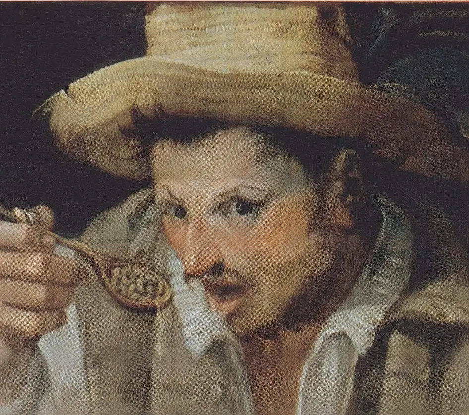
It may simply be the photographer/scanner used, or when it was taken. For example, ones in public ownership in the UK tend to all be photographed for artuk.org (the link is to other paintings by the same artist), with pretty consistent guidelines, so they all tend to be fairly consistent with each other in terms of colour, brightness, contrast etc - although ones taken as little as a few years ago may be completely different in visual quality. Ones in private ownership, or overseas galleries may be done with completely different lighting, settings and colour reproduction.
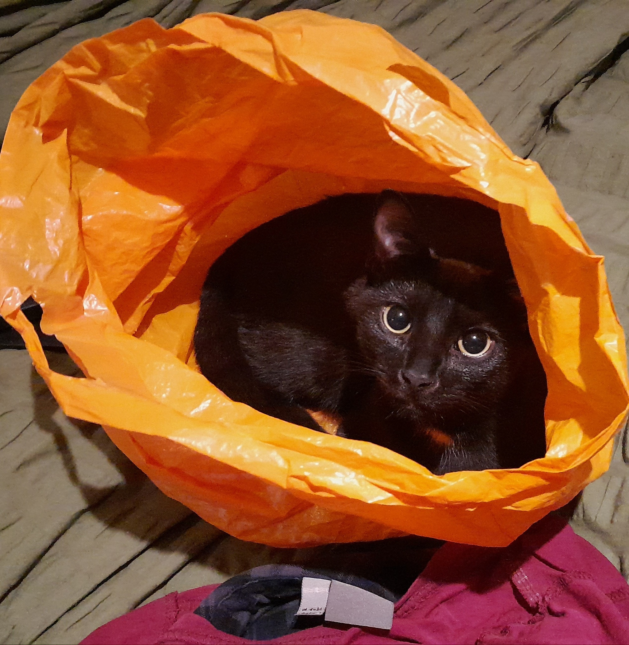
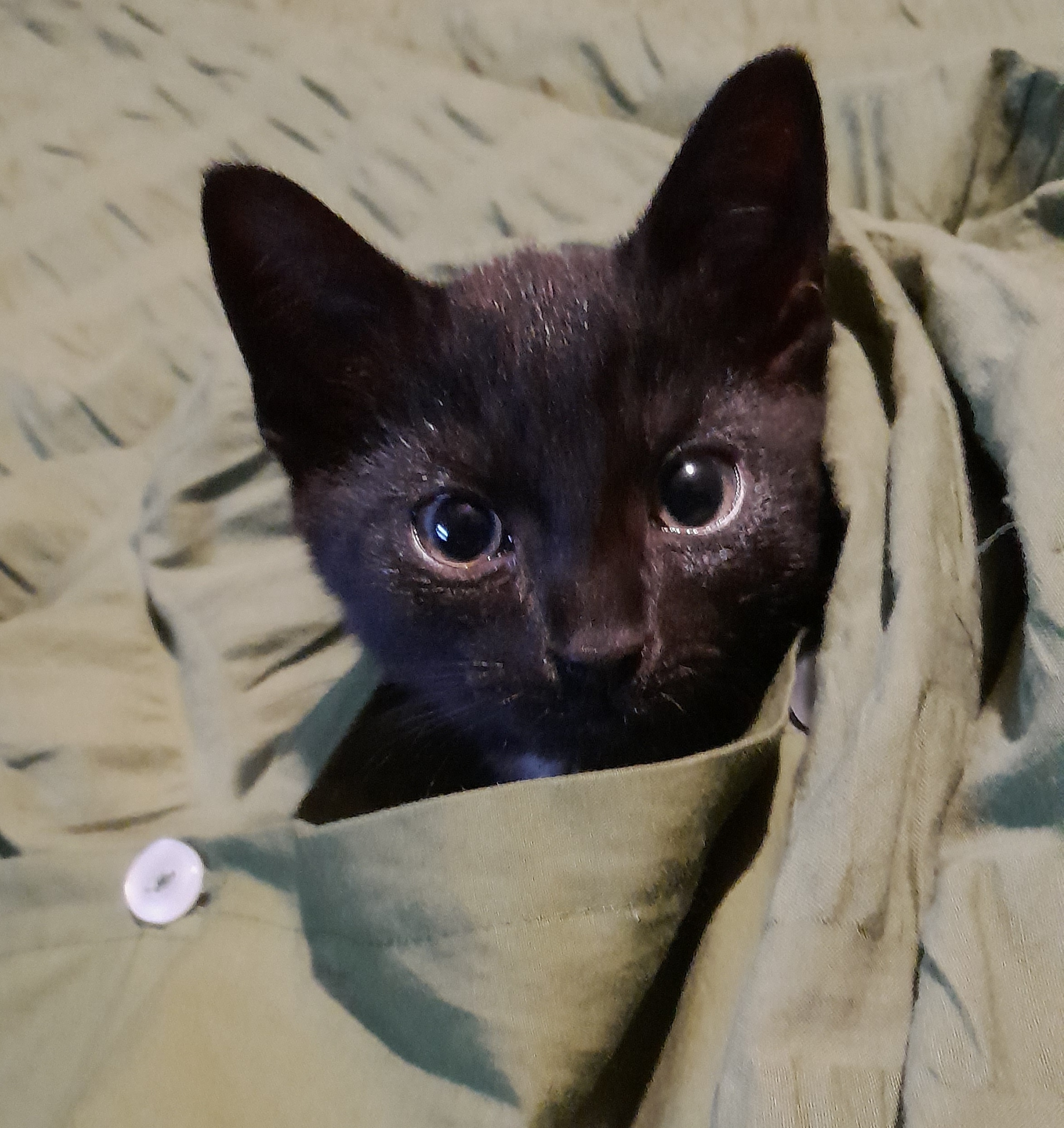
All three of ours play fetch, but only with specific objects. They’re all brothers about 2½ years old.
The tabby cat plays fetch with fluffy toy balls with feathers on them, the grey cat plays fetch with spare cat collars and the little black cat plays fetch with menthol sweet wrappers.

I think you’re going to need some Blackadder to go along with your Monty Python.
Start with the second series though, as the first series is a little weaker (the characters and style are a bit different), and might put you off.
Also used to make Mummy Brown Paint (wikipedia link)
‘A spokesman for Northern said “We are inexcusably greedy and both organisationally and morally corrupt. Our constant quest to trick people so we can punish, prosecute and fine them, at the expense of putting any effort into having more than 50% of our dirty, overcrowded trains actually turning up, means we’re not fit to run a train service and we need to be nationalised immediately”. “Our CEOs and upper management deserve to be ritually executed by being tied to train tracks by a moustache-twirling villain”, he added’.
I might have paraphrased a little bit, but essentially that’s what I heard them say.

I hope that’s shared out amongst everyone. If it’s a tax increase of £25bn each, I must admit that I may struggle to pay it.
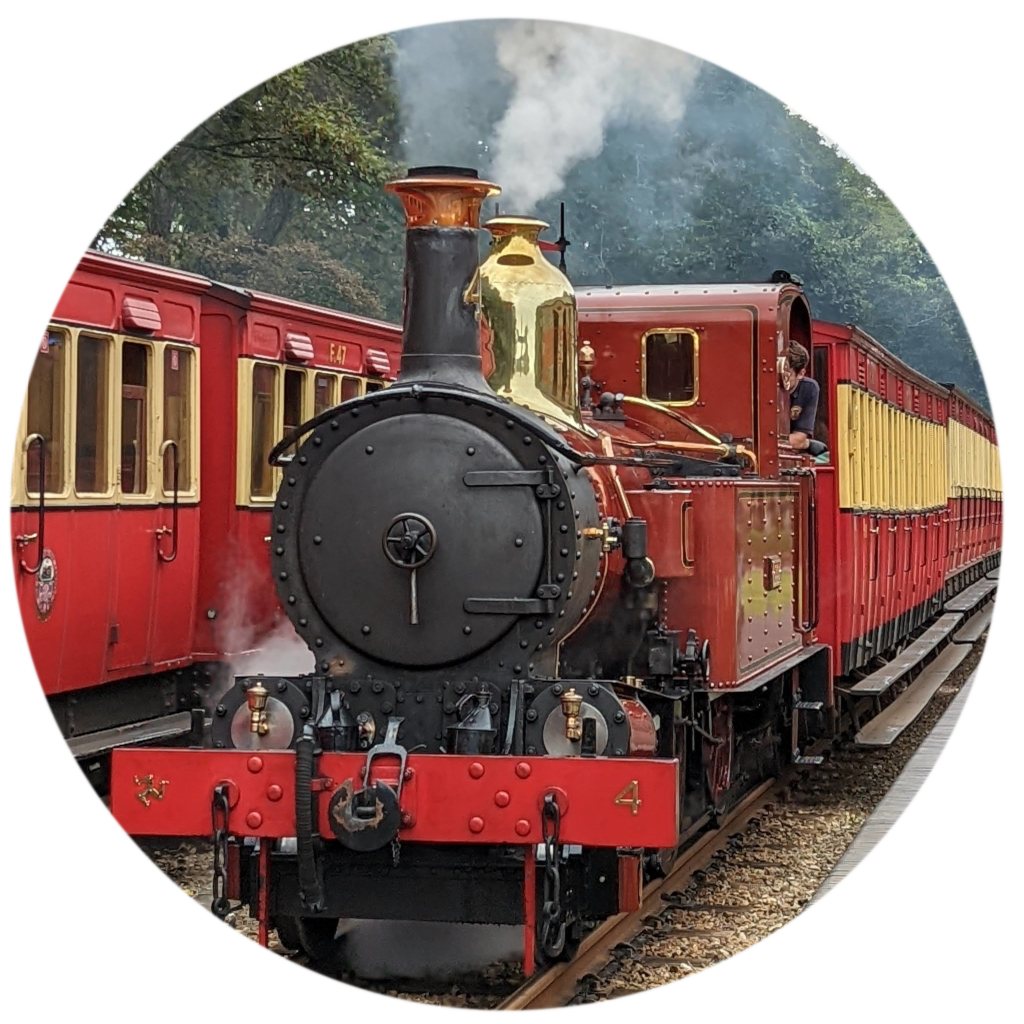
People always post really awesome ones and make everyone else jealous, so here’s a disappointing one to make you all feel better:
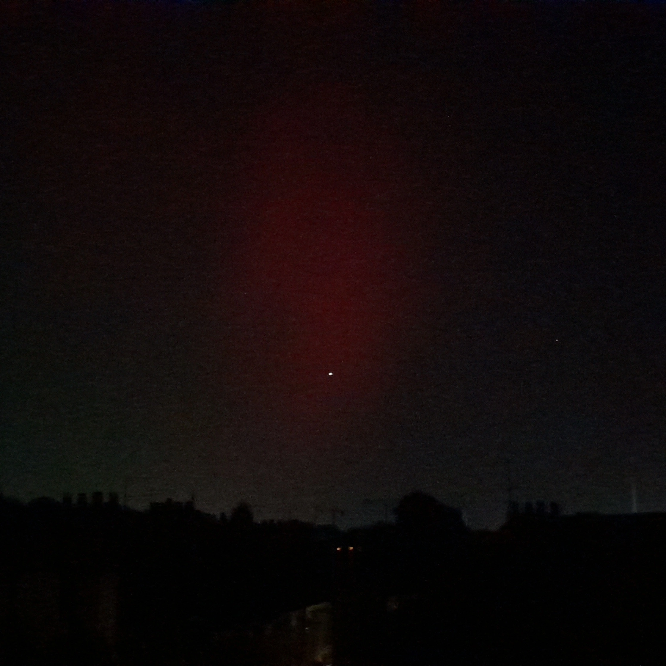
There’s a mildly red patch in the middle.
Though it is indeed some kind of light, and the local region is definitely considered Northern, and therefore it’s definitely some form of Northern Light, it’s quite possible it’s not the sort of Northern Light we’re aiming for.
It’s probably just pollution or a stray bit of light from an event - though maybe I’m too early, and it’ll look awesome in a few hours?
[Edit] I’ve just looked at this photo on my computer and it’s far clearer - on my mobile (which I used to take it) the red was a barely visibly smudge in the dark sky.
Hahaha. Oops. That one was automatic/accidental, but I’m not going to change it :)
As mentioned above/below, perhaps it should have been wikipædia :)
Twitter is actually 1982’s classic erotic Atari 2600 game "Beat 'em and eat 'em.
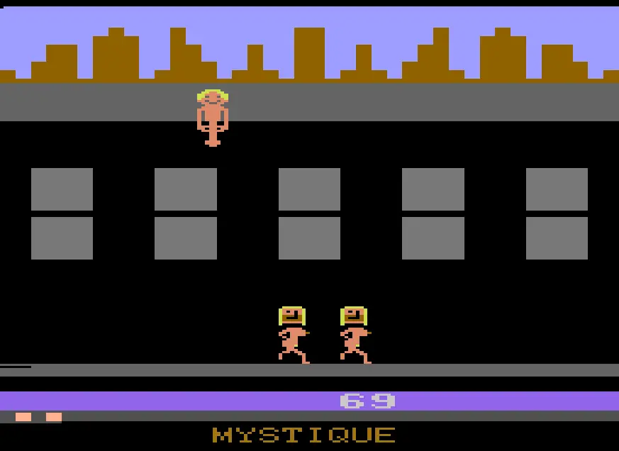
There’s Vladimir Putin at the top of the building, firing his pixellated ejaculate over the side and the player controls both Elon Musk and Donald Trump, running left and right with their mouths open to collect it.

I agree that “not voting for the Tories” was pretty much the main driver, but these are not “new options”.
The Brexit Party’s “surprise” increase this year, was in many ways just returning to the 10-15% that they received as UKIP in 2015.
In the two elections in between, they agreed to not contest many of the Tory seats, to not risk “splitting the vote” to help keep “evil Jeremy” out of power.
The Tory vote + Brexit Party vote, added together, is lower than the number who voted for either Boris Johnson, Theresa May or 2017 Jeremy Corbyn. Fewer people voted for Keir Starmer than Jeremy Corbyn in 2017 or 2019 - so technically the biggest change in vote is probably “did not/unable to vote this year”, with an increase of 3 million.
As ever, “didn’t/unable to vote this year” won yet another successive landslide victory of about 20 million, or about the same as the top three parties added together.
Anyway, apologies for the tangent. The graph is particularly looking at younger people, who are on average more left leaning, and have become more so in the last 40 years. Though the recent mainstream politics/media shift towards the far right is absolutely terrifying, I don’t think it’s reflected in the young people shown in this graph.

I’m under the impression that pretty much all railway maps are based on, or developed from, the style of London Underground (also known as “The Tube”) maps from the 1930s onwards - so they all look kind of similar, because the designs all grew and developed from the same starting point.
The graph appears to show that from approximately 2010 (Libdem & Tory coalition) onwards for women, and a few years later (when we somehow got a full Tory government) for men, the younger people shown on the graph, said or thought something along the lines of “this Tory government is awful and we need to move in the opposite direction”.

Great, I’ll look in to that, thank you - and I hope you do write such a book one day :)


Should we make that the new community logo/banner?