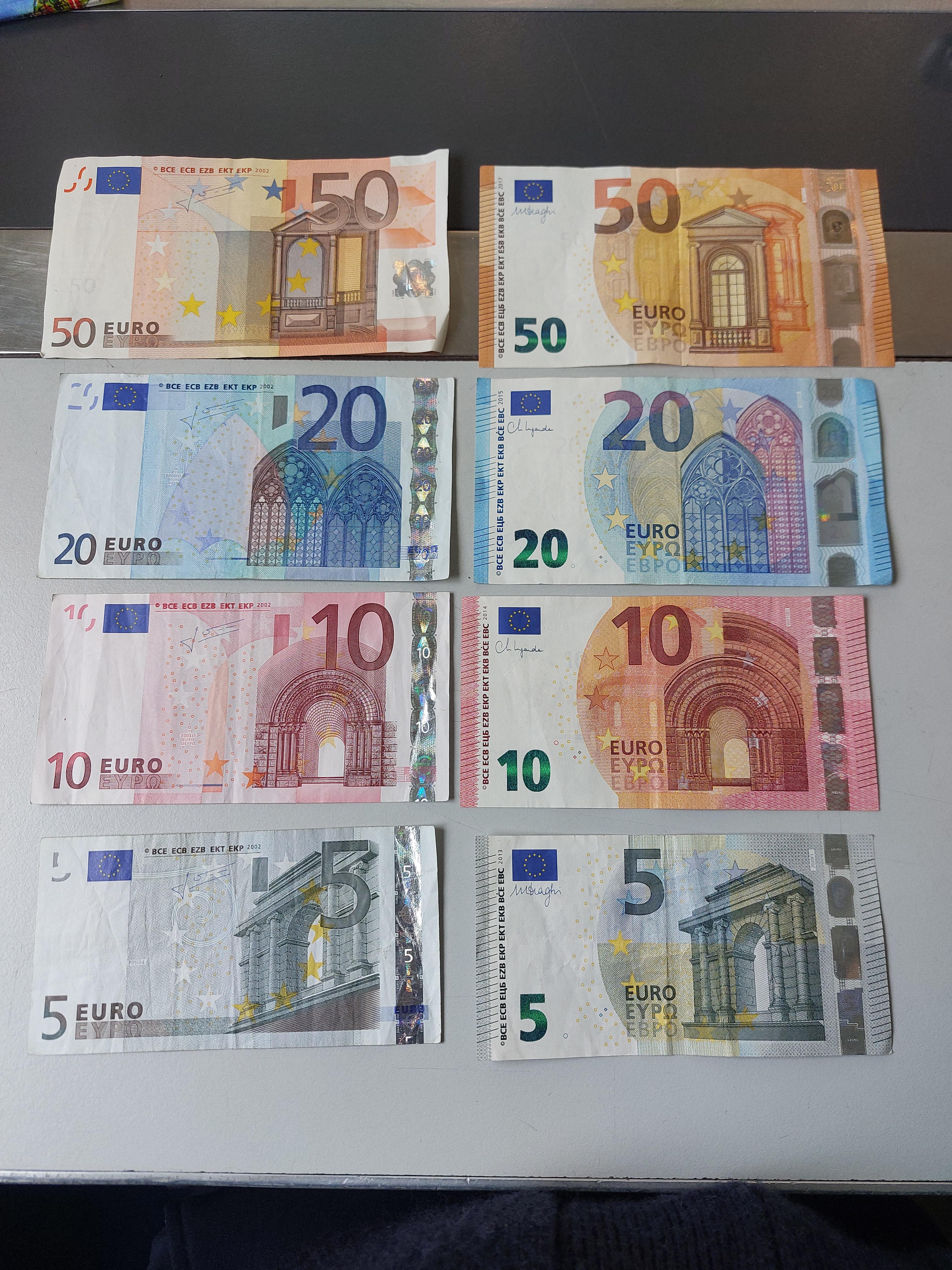
The Euro notes look like what you’d get if you asked for prop banknotes for a minor scwne in a nwar-future sci-fi movie. The basic design elements are there to give the general look of currency, but something always seemed missing.
I think it’s the lack of text-- most banknotes have a big, prominent issuing authority name rather than the tiny copyright line of abbreviations, and often some flowery “I promise to pay on demand” legal language leftover from when the note was a stand-in for a stack of silver coins.
i feel like you get this impression just because they’re colourful, which like… monopoly money is colourful because that makes it super easy for people with full vision to tell them apart, and as it turns out that’s useful for actual legal tender as well :O
I think it’s more about “does it fulfill the tropes paper money has established.” It’s like how many of the new electric cars look slightly off because they’ve removed design features (i. e. grilles with obvious air intakes) that are established in cars already.
Interestingly, Soviet banknotes up to the 1961 series would print the denomination in over ten different languages.
Firstly, the issuing authority’s abbreviation is there. In all the languages. Secondly, the denomination is printed in a way that’s intelligible to all nations :)

The Euro notes look like what you’d get if you asked for prop banknotes for a minor scwne in a nwar-future sci-fi movie. The basic design elements are there to give the general look of currency, but something always seemed missing.
I think it’s the lack of text-- most banknotes have a big, prominent issuing authority name rather than the tiny copyright line of abbreviations, and often some flowery “I promise to pay on demand” legal language leftover from when the note was a stand-in for a stack of silver coins.
i feel like you get this impression just because they’re colourful, which like… monopoly money is colourful because that makes it super easy for people with full vision to tell them apart, and as it turns out that’s useful for actual legal tender as well :O
I don’t think text makes any sense. As you can see, we have three ways of writing “euro”.
I think it’s more about “does it fulfill the tropes paper money has established.” It’s like how many of the new electric cars look slightly off because they’ve removed design features (i. e. grilles with obvious air intakes) that are established in cars already.
Interestingly, Soviet banknotes up to the 1961 series would print the denomination in over ten different languages.
Firstly, the issuing authority’s abbreviation is there. In all the languages. Secondly, the denomination is printed in a way that’s intelligible to all nations :)