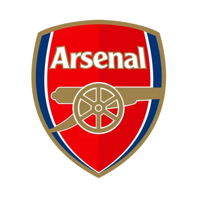
Should the current club badge be redesigned?
Personal opinion: I really dislike it, but I’m curious if it’s just me. It feels like design has moved on massively from the early 00s and several other clubs have updated their badges very tastefully (ignoring Juventus, of course) in more recent years.
A quick Google brings up a number of great concept designs. I’d love to move away from the current badge but what do others think?
Absolutely not taking credit for this (I don’t have any design talent) but one of my person favourites can be found here: https://boards.sportslogos.net/topic/105579-new-arsenal-logo/
Side note - I think the current trend of just the canon on the away kit looks amazing.
So how does the community feel? Keep the current or is it time for a rethink?


The only thing I’d potentially want to see is the elimination of text (as on the third kit, as you say) and the inclusion of the ‘Art Deco’ crest, e.g. as the ‘hub’ of the cannon’s visible wheel.