- cross-posted to:
- socialism@lemmy.ml
- technology@lemmygrad.ml
- technology@lemmy.ml
- cross-posted to:
- socialism@lemmy.ml
- technology@lemmygrad.ml
- technology@lemmy.ml
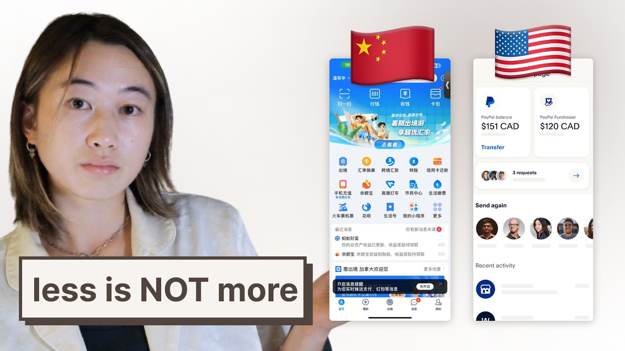
I’m going to use this video as a reference for my own website project.
What do you all think?
It seems that Japanese and Chinese website design is just superior to Western design.
The comments are bad as usual haha


That’s so interesting! Thanks so much for all the context and screenshots.
That does seem appealing, especially with the alternative being to Google for details and hope the reviews you find are legit/not bought.
It’s really interesting that they aren’t trying to make both the end user and subapp company pay to interact, that’s refreshing.
I wrote out a whole thing/rant about how providing core services to the people and market all seem like a no brainer, but it got a bit convoluted. Long story short, this all looks pretty interesting, I’ll definitely check it out more.
Last thing, having ads you opt in to see, that are worth looking for, seems so nice. Everything is an ad now, where it’s google or any other generic product review site. It’s exhausting having to determine if any info you find online is legit enough to be useful.