- cross-posted to:
- socialism@lemmy.ml
- technology@lemmygrad.ml
- technology@lemmy.ml
- cross-posted to:
- socialism@lemmy.ml
- technology@lemmygrad.ml
- technology@lemmy.ml
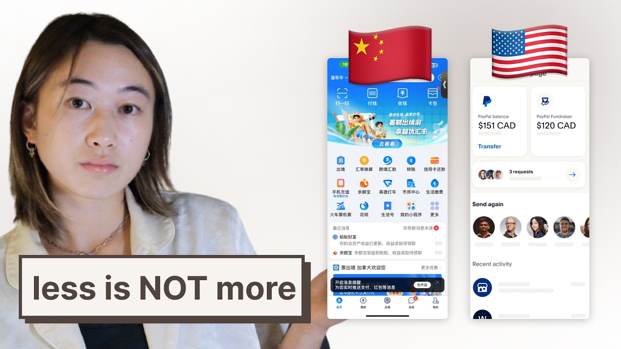
I’m going to use this video as a reference for my own website project.
What do you all think?
It seems that Japanese and Chinese website design is just superior to Western design.
The comments are bad as usual haha


dead empty space is literally settler culture.
things that immediately jump to me that are very western are lawns, parking lots, suburbs and now app design.
Lawns are the Devil.
Lawns make suburbs especially virtually unwalkable because everything is so far away from each other…