- cross-posted to:
- socialism@lemmy.ml
- technology@lemmygrad.ml
- technology@lemmy.ml
- cross-posted to:
- socialism@lemmy.ml
- technology@lemmygrad.ml
- technology@lemmy.ml
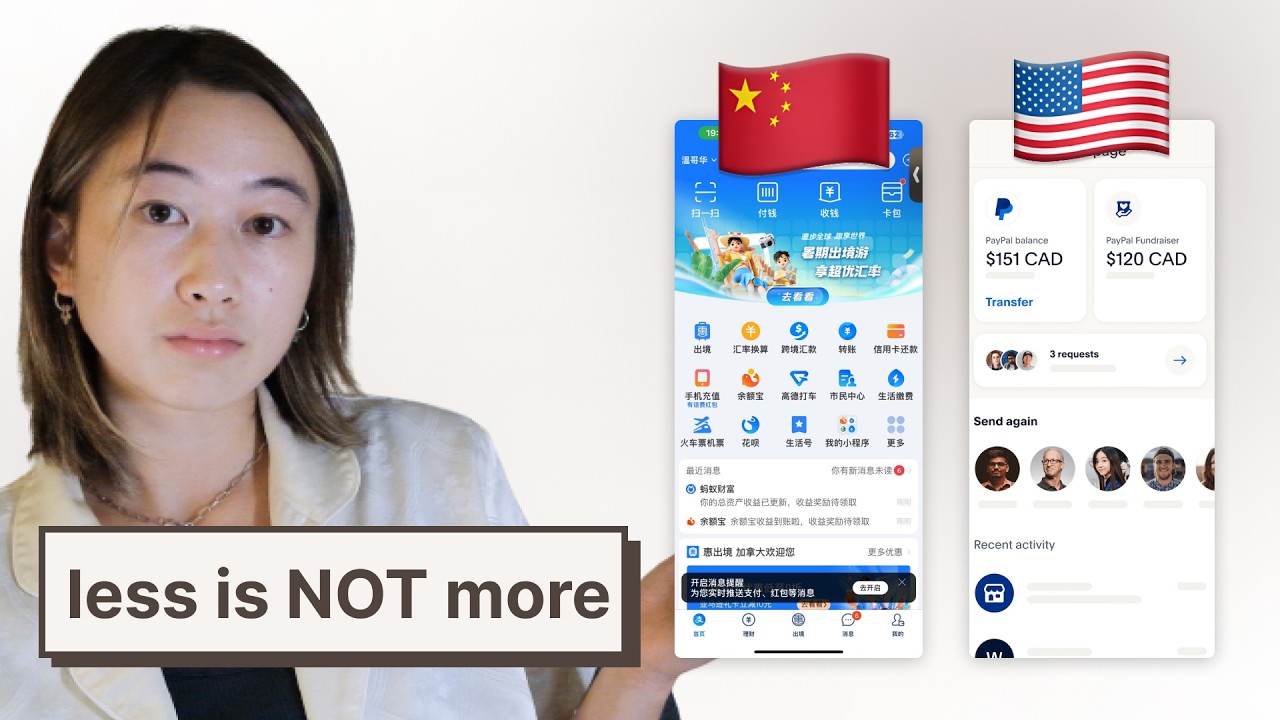
I’m going to use this video as a reference for my own website project.
What do you all think?
It seems that Japanese and Chinese website design is just superior to Western design.
The comments are bad as usual haha


Never experienced them but if they avoid the pitfall of stripping the interface so much than any slight deviation from the intended flow becomes a nightmare then yes, it totally is superior
The western minimalism can be really be irritating when you want to access any kind of more advanced options, and the idea behind this choice is that users are basically toddlers who can’t learn anything, which is a very white way of treating others
It’s true that in UX design the motto is that users will find ways to break your app that you never imagined. But the disdain that westerners have for the end-user prevent them from realising that everyone simply needs to learn how to properly use things, and that yes they will put the effort if the tool is worth learning.
I hate the “Apple philosophy” of design.
Don’t make it simple to the point of simplistic.
Less is not ALWAYS more.