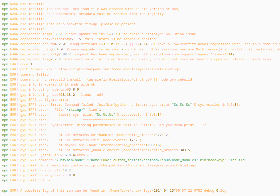
I posted a comment on !linux_gaming@lemmy.ml that can be found here and noticed the Code-formatted text can be a bit hard to read.
Below is a screenshot of a segment of what I am referring to.

Would it be possible to adjust this or does this happen automatically by inverting the colors for example?
It’s worth noting this doesn’t happen with the Tesseract version but I prefer the older layout. It isn’t a big issue, it isn’t something that I see used very often across Lemmy, but it can be nice for dumping chunks of formatting sensitive text.
You must log in or register to comment.

