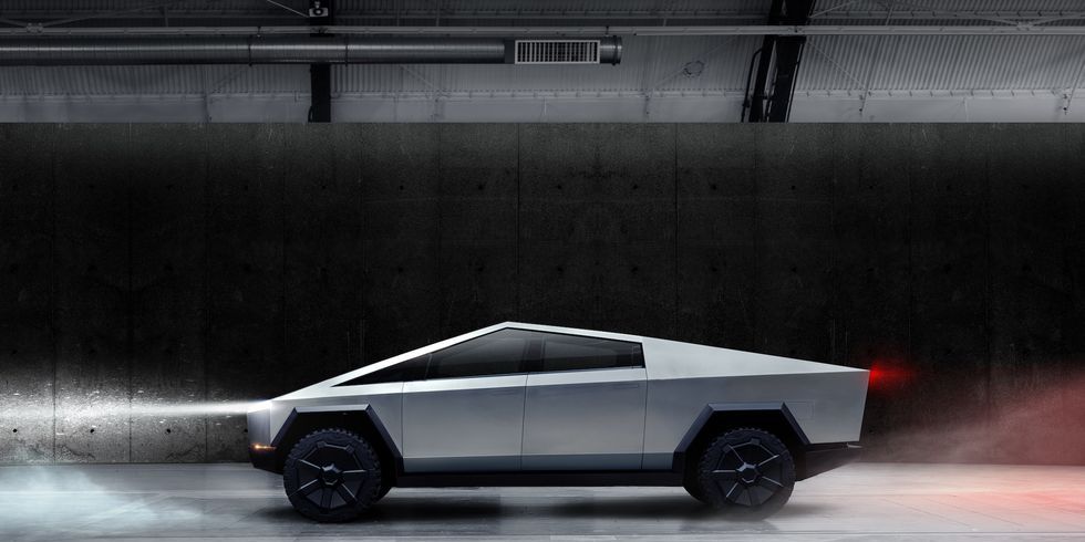
As Jeremy Clarkson would say, it was designed by a man who only had a ruler.
What he said had little to do with the Cybertruck specifically. He defended avant-garde design as a concept, which is to say he said something valuable but hardly controversial. The avant-garde is meant to challenge the status quo - often aggressively - and for that reason will always be polarizing. But that’s its purpose, to challenge and propose new ways of considering or approaching or viewing a topic; in this case the notion of what a vehicle should look like and whether the vehicle and those who design it have a duty to the public regarding aesthetics (this is a popular debate in architecture, for example).
Car enthusiasts in particular are extremely conservative when it comes to design, so anything markedly different is usually received negatively, and only through the lens of nostalgia are many challenging designs viewed positively. The article even says the DeLorean falls in that category. But it’s important that design not stagnate because that limits innovation in other areas since in cars design is meant to interface with other aspects of the vehicle and all of that as a package is meant to interact intimately with the consumer. So designers should be encouraged to try new things. Some will flop and be forgotten, some will flop and be enshrined in ridicule, some will flop and be adored after they’re gone, and one or two special ones will have both critical and commercial success.
Im all for avant-garde design. please, make crazy stuff. But that doesn’t mean that anything crazy is also good. I didn’t love the concept but the production candidate CT just looks “off,” the proportions are weird. Something about the size of the wheel wells and the snub nose compared to the body makes it look very awkward. And simple can be really striking, but the CT just looks like a clumsy triangle and not badass to me.
But from a styling standpoint I will give it a fair shake when I see one in person.
Honestly, I don’t hate the examples that are well put together, those look fine.
The problem is the design accentuates any errors to the point of being comical.
needs to loose that legend title then
“Design legend Giugiaro D”
Don’t scare us like that.

